Annie’s Fish Tales
Instagram angler influencer looking for a spiffy new logo.
Project Summary
Annie’s Fish Tales is the brand for the Sonoma-based professional kayak angler. Annie approached me for creative services including a logo design, Instagram post template for her upcoming tournament, and photography to showcase products for one of her sponsors.
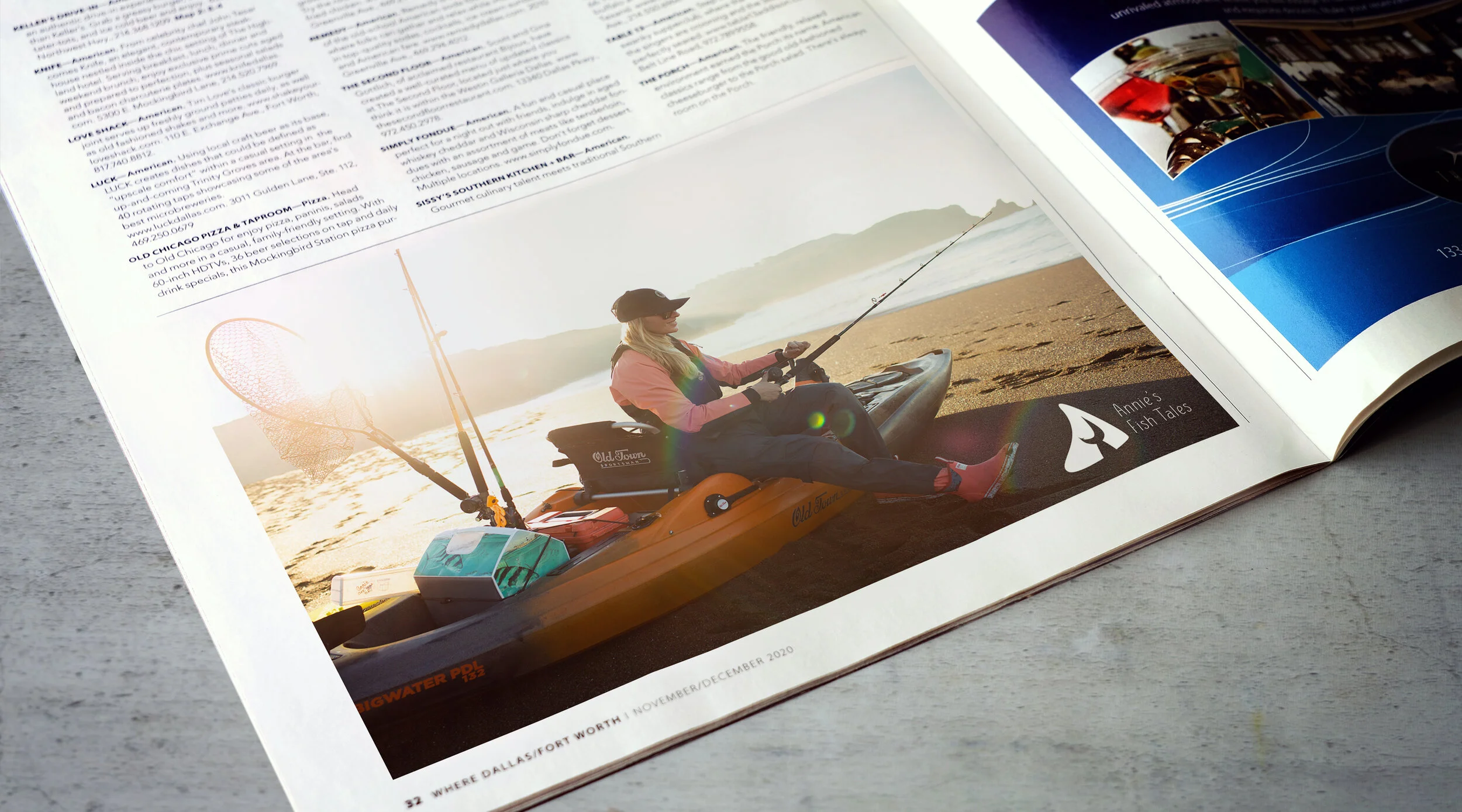
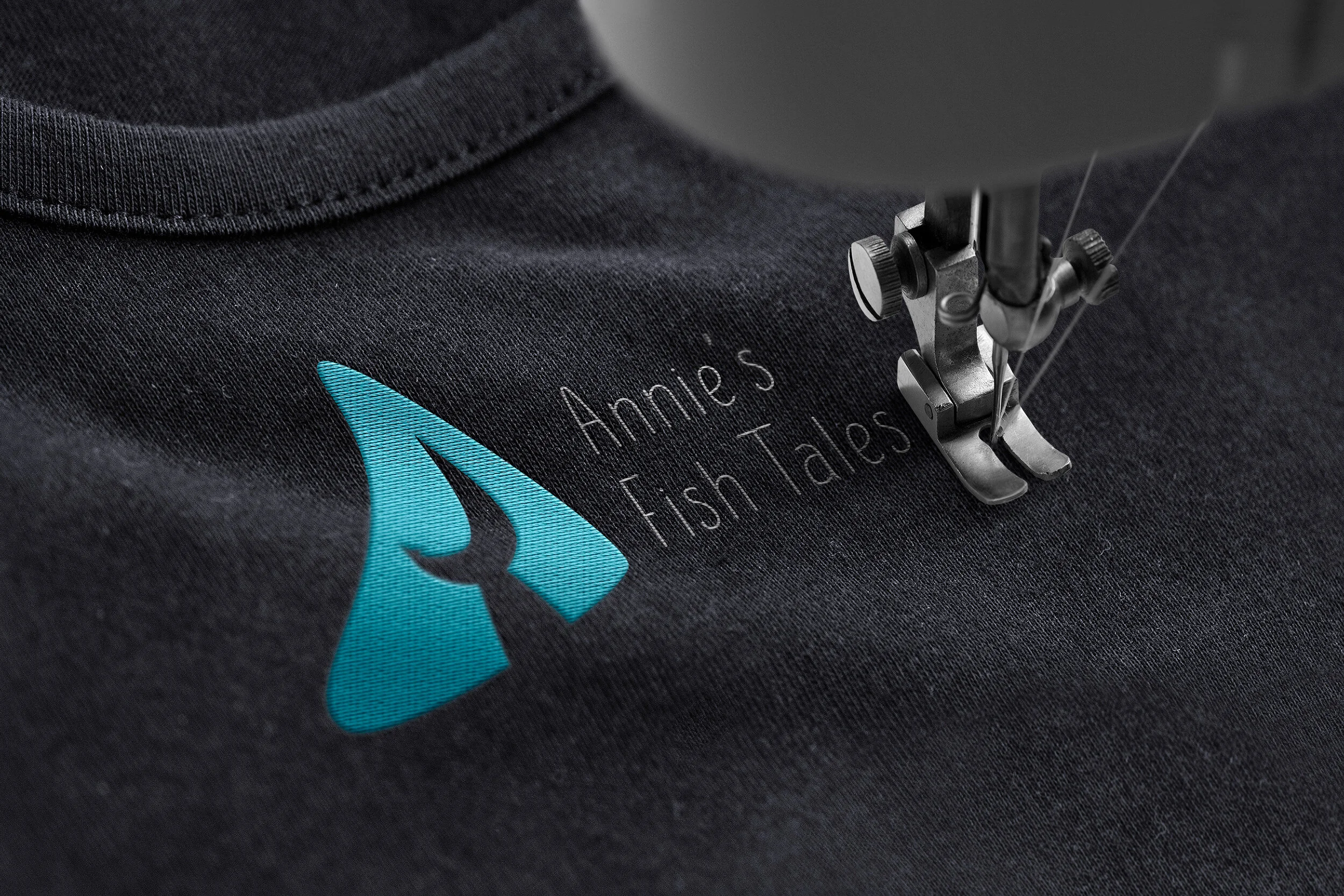
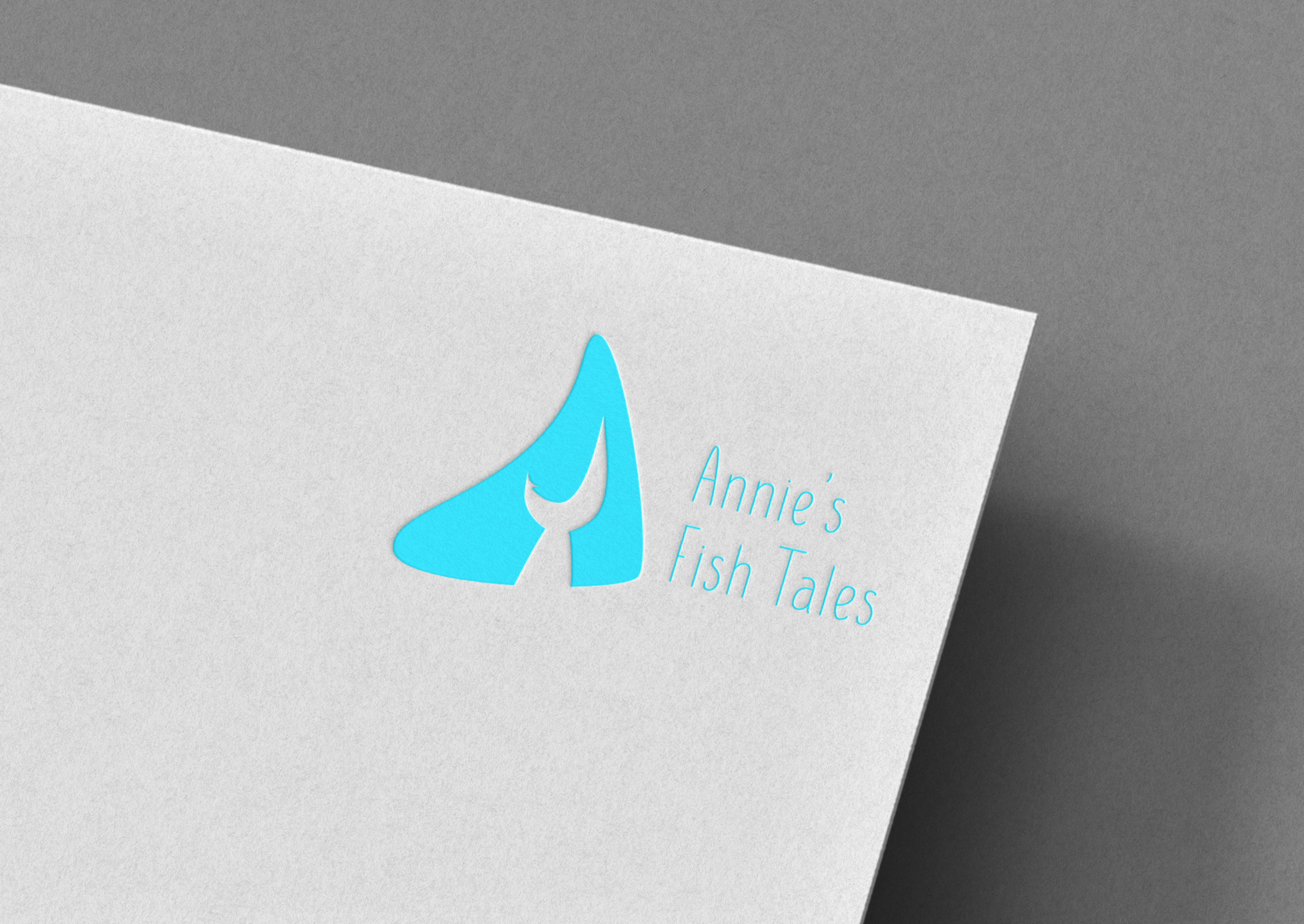
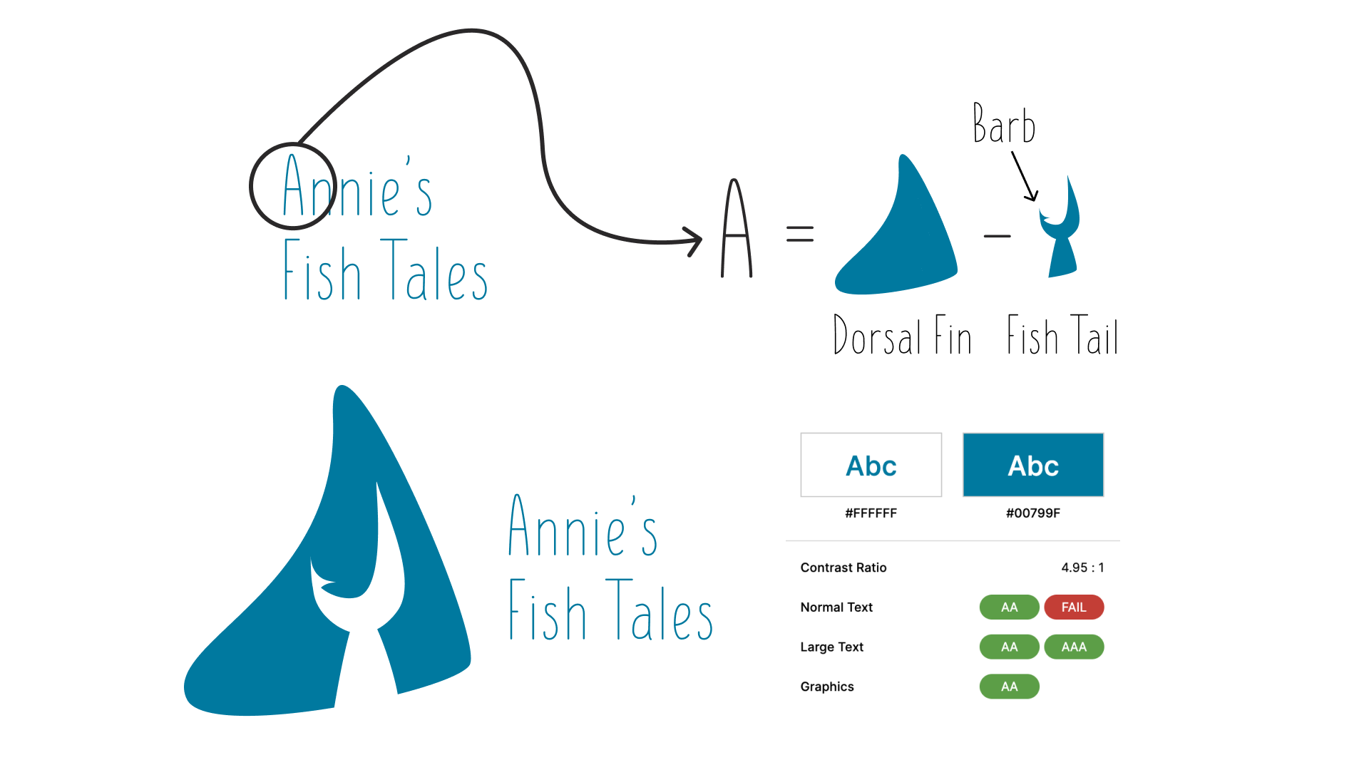
I was given free reign for the logo which features a dorsal fin representing an A, and the negative space shaped as a fish tale. Annie was thrilled with the design and her only feedback was that she wanted a barb added to the tail. I displayed her logo in the following mock ups.
My Role
Logo Designer
Company
Annie’s Fish Tales
Date of Project
Q3 2020
The Challenge
Annie’s Fish Tales approached me with a request for a logo. They wanted a simple and easily recognizable logo that took influences from the sea where they do most of their fishing. They wanted something that would look good on a hat or shirt, but also look great online and as part of their media packages.

The Design
Annie’s Fish Tales approached me looking for a logo they could use in their media and on their instagram. They were looking for something they could potentially put on hats or shirts.
Right away I went to work on sketches, knowing I wanted to do something with the A in Annie. Originally I had thought I’d have a fish tail shape where the tips of the fins pointed out like the legs of an A, but it ended up looking clunky and derivative of other sea organizations. While I was playing around with the shape of a fin, it occurred to me I could use the triangle shape of a typical dorsal fin as the main shape for an A, then incorporate the fish tail into the negative space to complete the effect.
I sent the first iteration just like the above but without the fish barb. The client requested a barb to be included as it looked like the fish tail could also be interpreted as a hook. My concern was that the barb might not be easy to do in embroidery but the client thought it was important to keep it, which is the design we have today. There wasn’t a specific color in mind, though I wanted to draw from the colors of the ocean. As a girl in the industry, Annie sees enough women-targeted products with pink accents and she didn’t want that to be the look she embodied, so I chose a more neutral color, with a bit more edge than a lighter teal. The color I ended up with has a contrast ratio of 4.95:1 which is important for accessibility. Annie’s Fish Tales was happy with the color and logo deliverables.