Habit AMP System
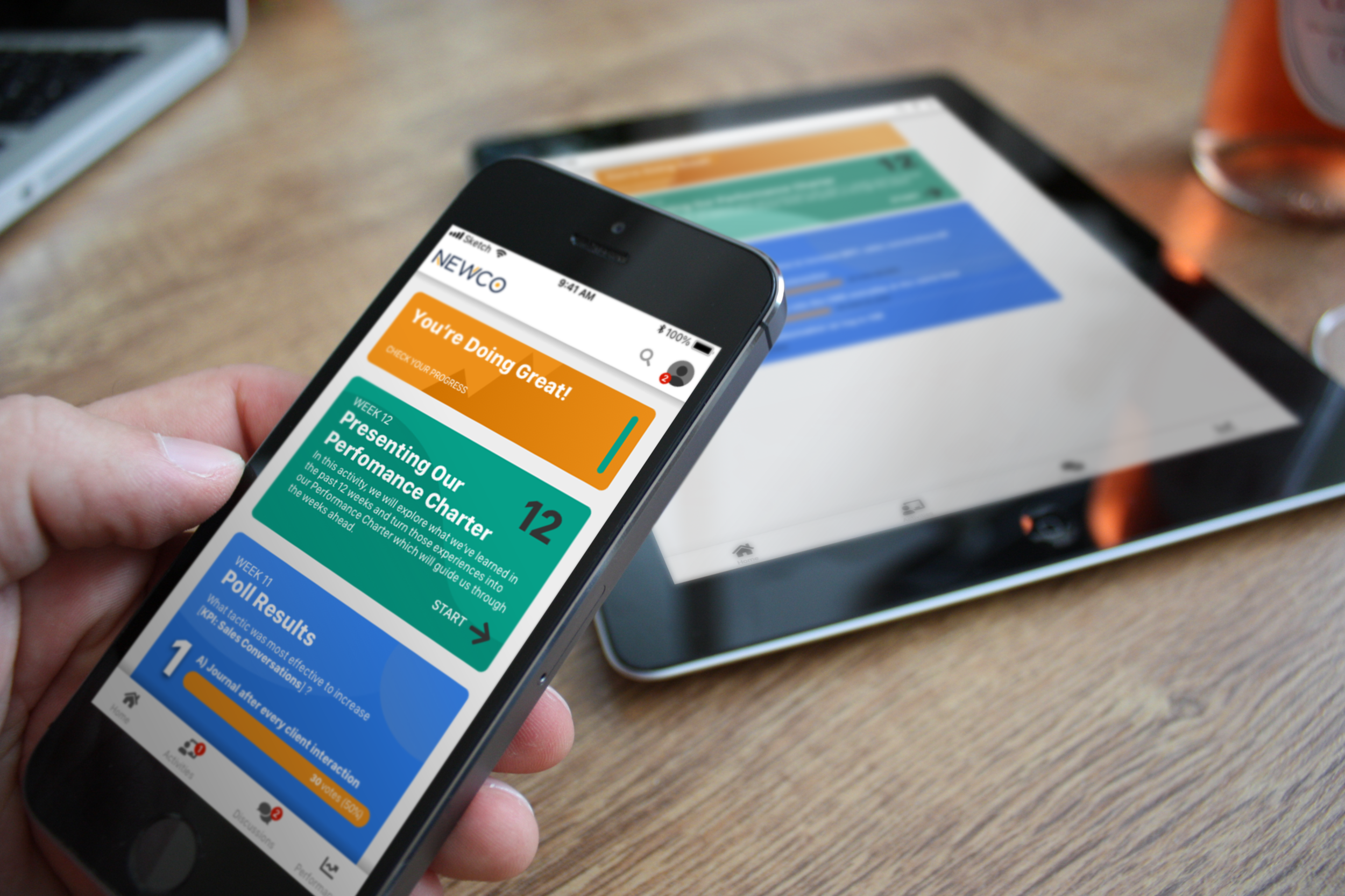
Mobile app and support services to improve team performance through micro-learning and habit stacking.
Project Summary
The Habit Amp System zeros in on small, specific habits among individuals in order to increase overall team performance. Content and curriculum are built through client intake to ensure a personalized feel for Team Members. Content is delivered on demand, anywhere via a mobile app. Lessons are quick, under 5 minutes each, and spread out over months to create a lasting impact.
My Role
Concept ideation, user flows, low-high fidelity wireframes, design, prototyping, usability tests
Company
Arnowitz Culture Agency
Date of Project
Q1 2021
The Challenge
Arnowitz Culture Agency was at a crossroads. It was in the business of million-dollar culture communities. Though effective and surely worth their money, the challenge was selling through multiple gatekeepers and departments and getting companies to make such a great commitment. With the pandemic looming and businesses tightening up their budgets, we needed a new light-weight product offering that could be utilized by much smaller teams, launch quickly, make a quick impact, and encourage expanded adoption throughout companies.
Our time and resources were limited. We needed to create a product that piggie-backed off our existing Aurora Culture Platform so we wouldn’t have to start from scratch. We also needed something that leveraged our core competencies in team member engagement, corporate culture, and team performance. Any time spent creating this project meant time away from existing work, so time was of the essence.
The Solution
Empathizing With The User
Our team at Arnowitz Culture Agency has decades of experience working with Fortune 500 companies to improve culture and performance, using a combination of strategic curation of content and globally scalable technologies to capture that content in the first place. Over the years, we’ve been exposed to exactly the kinds of challenges managers face when motivating their teams. Often, the most successful campaigns are those that focus on a single habit or behavior to improve. Choosing the right behavior and keeping an international team aligned can add to that challenge.
The other challenge was the budget – some managers don’t have the approval power needed to get these services off the ground. We wanted to build something that serves those managers by providing a lightweight service that’s easy on the budget, quick to launch, and agile enough to adapt as the program goes on.
Defining The Problem
In order to define the problem further, we worked closely with leaders in Emotional Intelligence and Cultural Intelligence research to better understand some of the underlying reasons why teams struggle to meet or exceed objectives. We used a lot of our own research as well to inform the type of problems we might see and strategies to solve them.
We also looked inward at some of the needs of our company to determine our next course of action. We found that our main product – a global online culture community capable of supporting tens of thousands of users – while extremely successful, was a challenge to get through the many gatekeepers of a prospective lead. We needed something more palatable, easier to approve, yet still as effective in producing results.
Ideation With The Team
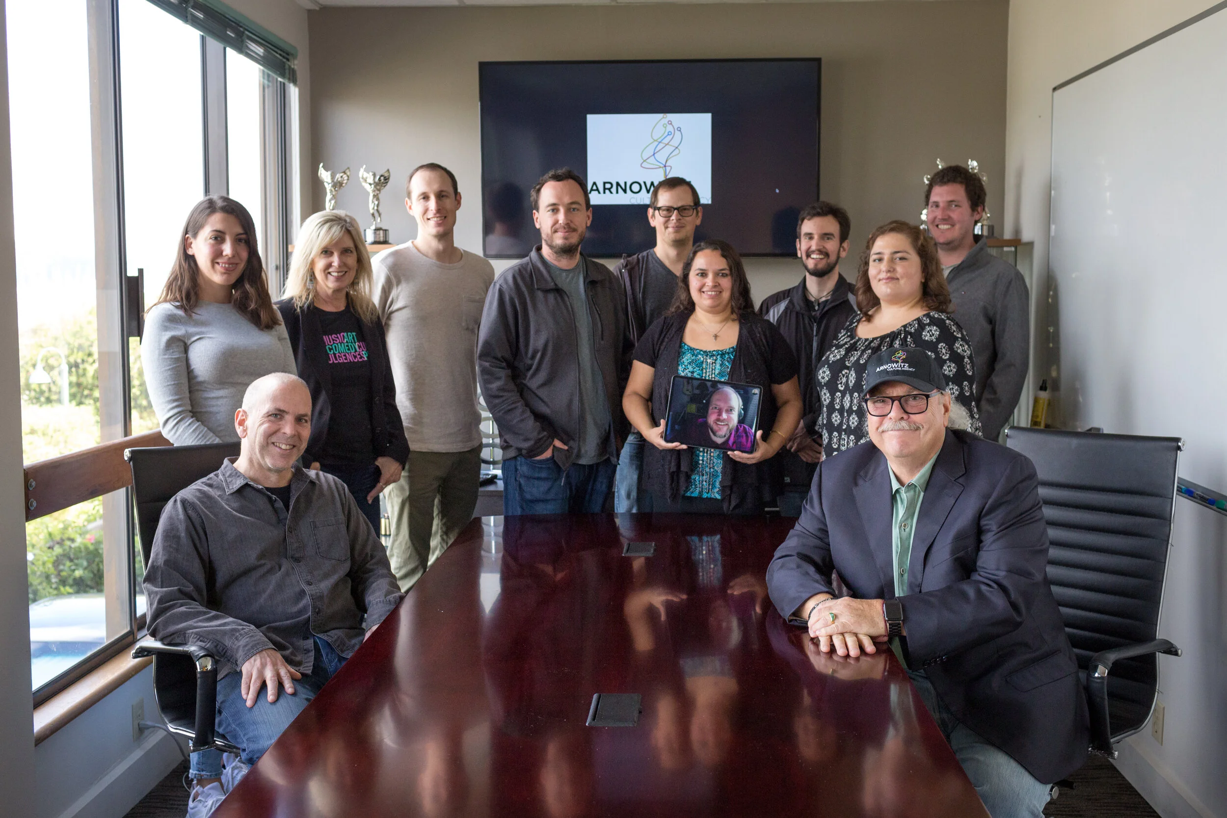
One of the great things about working for a small company is that everyone gets to contribute and every idea is heard and explored. We began ideation by working alone on our top 3-5 ideas, following a template that asked important questions like “who is the audience?” and “what industry does this cover?”, but more importantly, “How does this align with our strengths?”.
Following these guides we all came up with some fantastic ideas, but funny enough, nearly everyone had a similar idea in mind. Based in part on the success of the KPI Dashboard (See case study), a web app of our community platform, most people had an idea to adapt it as a standalone project. It would serve an audience we were already familiar with, in an industry we already serve, and we could use existing technology.
We created two personas with similar needs but different enough that it would inform the flexibility necessary to meet the needs of our target audience. With that, it was time to bring it to life through prototyping.
Planning
While some parts were familiar, we had a lot of work ahead of us to make this a standalone experience. We also needed clear constraints to work within. What functions from our existing catalog would we repurpose? What would we make from scratch? What would we omit? What did v1 look like vs. v2?
To help answer these questions, we began creating user flows that would identify different functions required, data points captured, and format to help inform the content creation.
In this example, we see a user flow for how a user might experience a poll question. We tried to envision the different starting points that a user could encounter a poll, in this case, either by finding it on the homepage or by seeing it in an article. We illustrated decision points with triangles. The contact points or places where we could capture data about the experience were really important so we wanted to account for those events as well. Those have been denoted by the circles. Different choices meant different data captures which could have impacted notifications, reports, and performance dashboards in other parts of the app. Green borders indicate where our team made a decision about the direction for V1. We carried out this exercise for all of the anticipated V1 and V2 functions of the app.
From here, we split into three concurrent tracks: Content creation, design, and development. All three tracks would follow user flows like these to inform content and design decisions. I was assigned to the design side of things, but I worked very closely with the other teams. I needed to work closely with the content team, of course, to set reasonable expectations for content layouts and restrictions. Likewise, I needed to work very closely with the development team so I knew what features I could push and what was maybe too ambitious or not in line with our capabilities given the timeline and budget. We met daily with our progress to ensure we were on the same page. Constant communication with design, content, and development meant we were able to introduce changes, make discoveries, while cutting when necessary, without leaving any of the arms behind.
Design Limitations
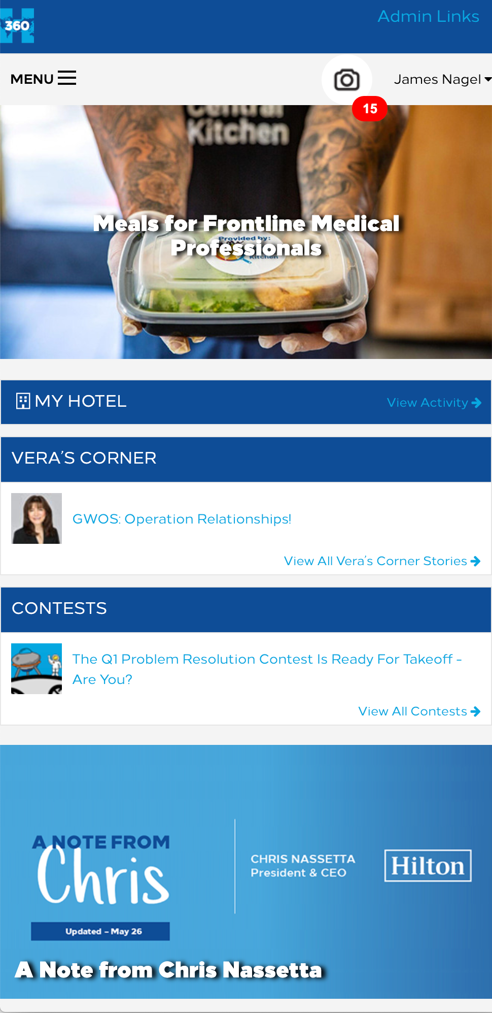
From a design standpoint, we had some pretty stark limitations. We were on a short timeframe and a limited budget and needed to do as much as we could with our existing technology, the Aurora Culture Platform, pictured on the right. The existing technology was rigid and not very forgiving, which kept us from making certain design decisions for the first version.
Essentially, we were using the backbone of a web app to create a mobile app. The eventual app would be a website built within an app wrapper, not a native app. This mean’t we couldn’t follow just one design style for a specific OS. We also had a block style homepage that scrolled to as far as there was content. We applied this to our app, so in some cases, the blocks don’t fit perfectly. This is because we couldn’t create sizes that lined up perfectly with every device. We decided to stack our content and in some cases it would fit well, while others, there would be some scrolling.
The icons we used followed the pattern from the original website. We used FontAwesome icons when we could since our system was already configured to use them. It was easier to apply styles and get them to fit in with the text areas this way.
There were also implications of the design staying the same to maximize our ability to manage the product on the backend. By keeping some of the existing patterns in place, we were able to keep the backend functions the same so our managers could apply content quickly and consistently. We had to make certain sacrifices for the design, but overall, we were still creating an app that had all of the essential functions of a minimal viable product.
All this being said, I think we made dramatic improvements to the program, certainly a step in the right direction to create a compliant and accessible product. And this was certainly a phase 1 plan. We expect to polish these elements over time. We needed to get an MVP product together to start before we could really get creative and break out new features, new design language and patterns.
Wireframes and Prototyping
Given our constraints, we still wanted to create a distinct app that met the functional needs of the new product. The purpose of the app was to host a short series of activities, help user complete these activities, and provide a dashboard of data to help a user track their progress and success. We also wanted the lessons to be a collaborative experience. You could do the lessons at your leisure but discussions embedded within them offered a space for insights from the field. I was responsible for creating these wireframes so we could begin to see how a user would experience the application. We wanted to see the flow of an activity from the homepage to the complete 12 weeks. We started with the homepage, shown below.
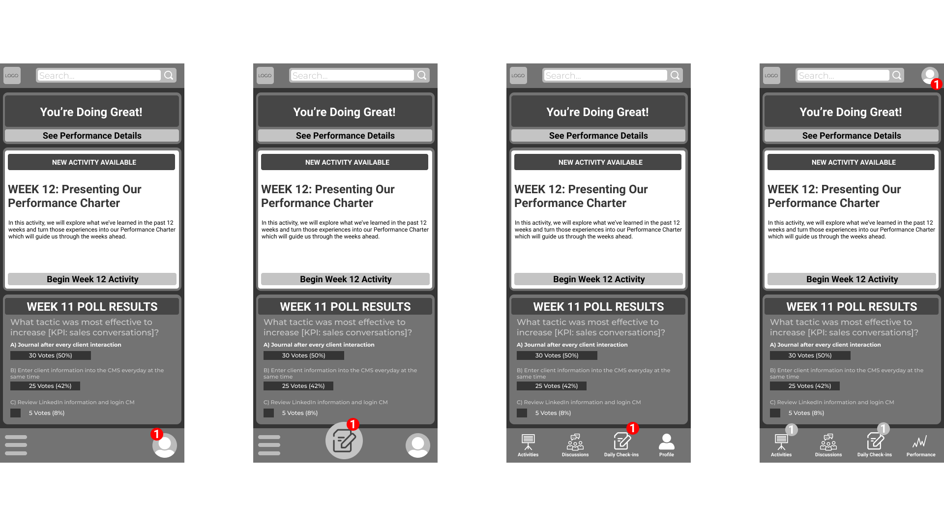
Given the structure of the existing homepage of the Aurora Culture Platform, I started with a wire that made no changes to the positioning, only content changes. The content blocks were already stackable without vertical limits, and I could make the content any image, with some flexibility over text. One thing to note with the content, was the hierarchy. We wanted the center CTA to draw the most attention, as it is the critical piece to announce the next activity is live. The second most important is the top section, which is darker, but given the top spot. It is also more condensed to keep the CTA visible on all screens. The least important is the bottom section, which offers supplementary or extra information to the user.
In the first example above on the left, I used the existing hamburger menu and profile menu button, but moved it to the bottom to make room for the logo and search bar without stacking them. I also included an alternate we used for the culture sites which had a quick share button, but we were already leaning towards not having a global share option so this button didn’t seem necessary. I also presented versions using app icons since we could comfortably reduce our menu options to four, and eventually five categories.
The rightmost example is the one I recommended to the group since it reduced clicks for the user and better embodied the look and feel of an app. The team agreed and we went forward with the design. Then we moved forward with the activities.
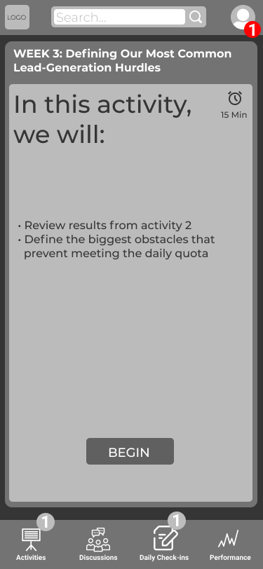
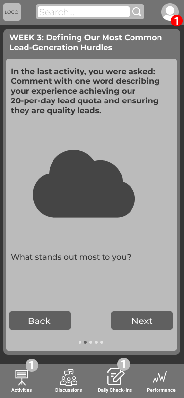
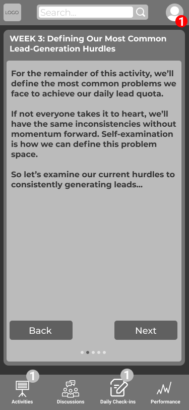
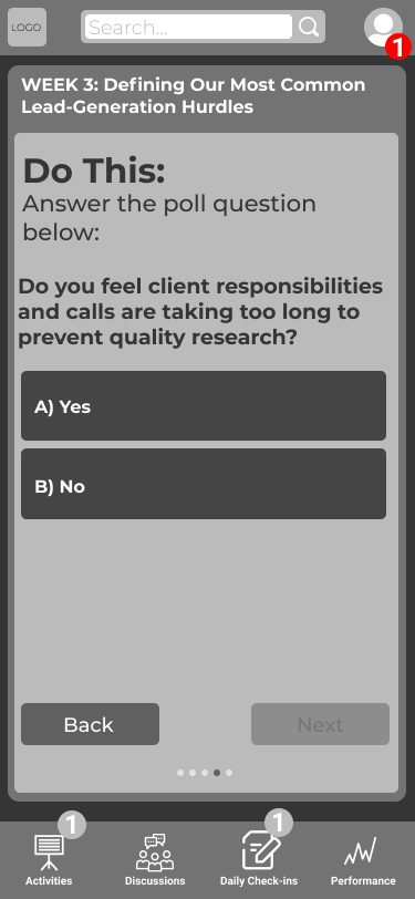
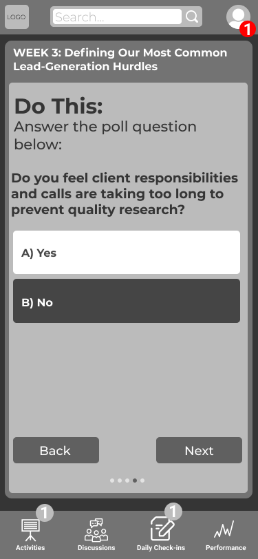
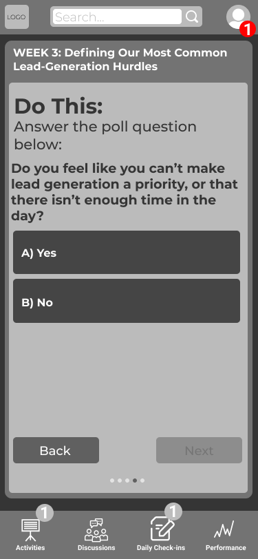
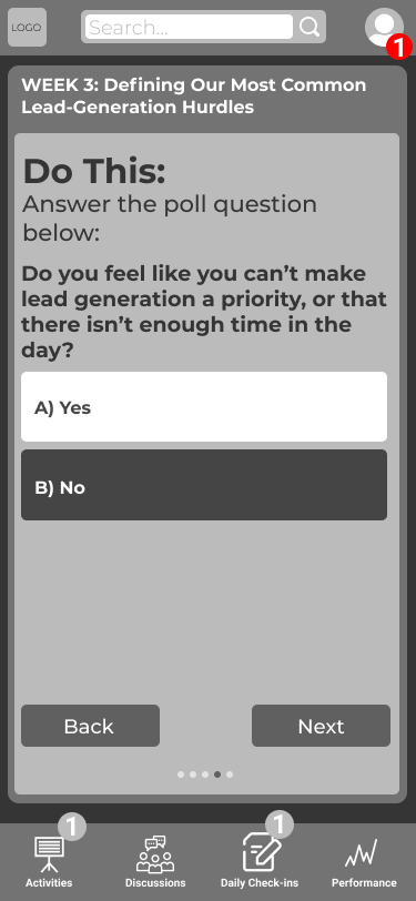
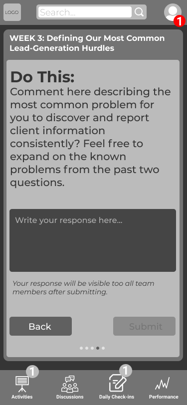
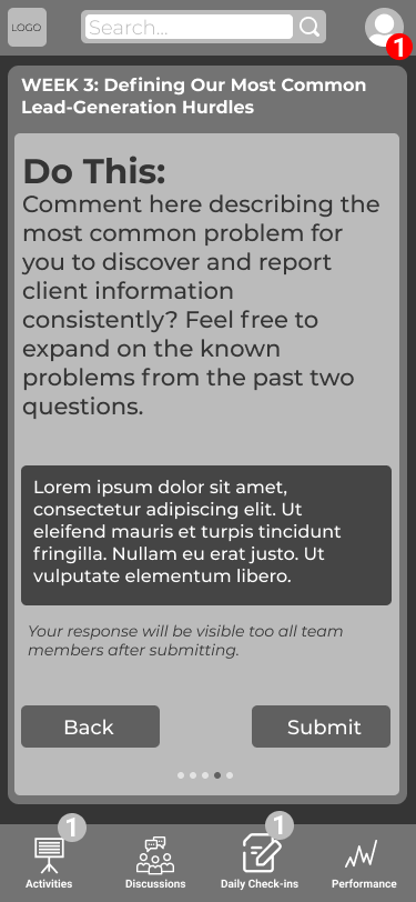
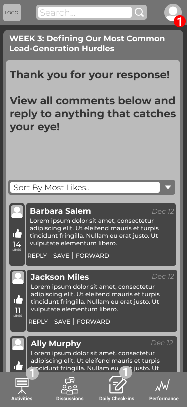
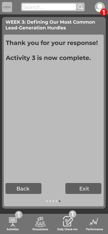
Above, you’ll see a wire of an example activity. This was an interesting process, as I worked concurrently with the writing lead to see how it all fit together. It was a back and forth, where the writing would come in, I would wire it, the writing would be revised, I would rewrite, I would see where there was an opportunity to condense the writing and functionality required, and so on and so forth. We built out the complete program of 12 activities to see how it all would come together. Then it was time to design the product.
Design
Once we reached consensus on the wireframes, I worked directly with an outside designer to express which elements from the wireframes were fixed elements and which elements could be flexible. We worked in batches, starting with a single example screen from each section of the app. Then we did a complete activity for styling, and eventually the performance page. We received new design concepts each week which I would summarize with my finding and present to the development team and the CTO. We would consider the impact on technology and effectiveness of expressing content hierarchy, among other things, I would summarize the feedback, and bring that to the designer.
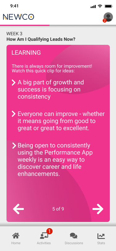
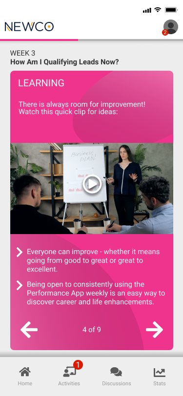
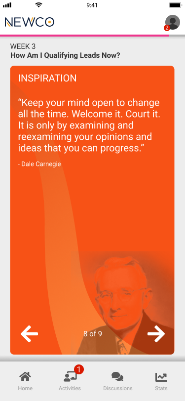
One element we really wanted to accentuate was the concept of cards. The activities were supposed to act as a small stack of note cards or a deck of cards that you swipe through. We thought that would emphasize the lightweight style of learning through the app, as well as the idea of ‘habit stacking’, or combining habits through existing cues to strengthen them.
I made the mistake of communicating that because the app was essentially a website in an app wrapper, that the screen size wasn’t as important. As a result, the screens we received were an odd proportion. I spent a lot of time reconfiguring the screens to be optimized for iPhone 10 first, then it could be adapted to other break points after.
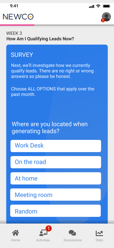
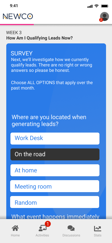
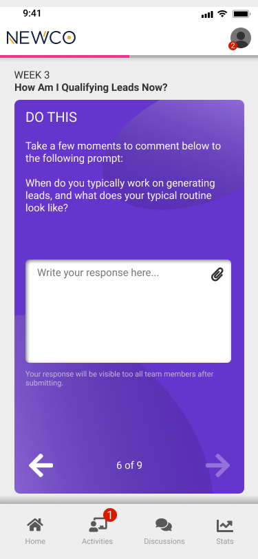
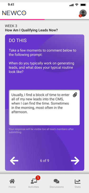
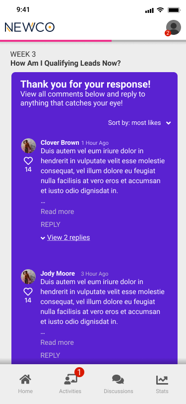
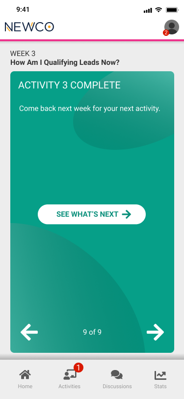
Once the design elements were in a good place, I was able to dig in and modify them with the approved writing content to create high-fidelity prototypes that mimicked the functions of a full lesson. This is what that looked like for one lesson:
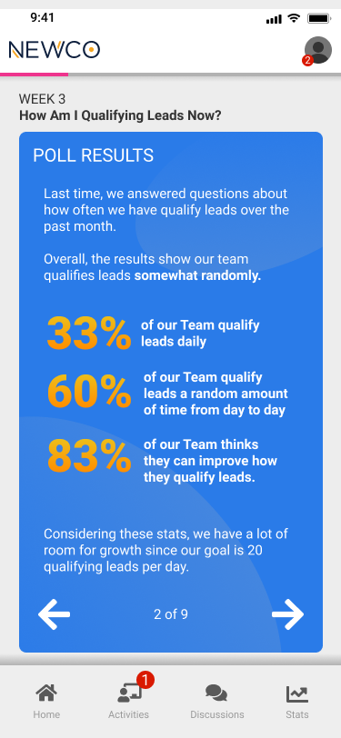
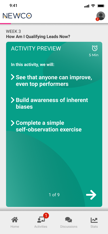
Interactions
Some interactions were better expressed through video. I wanted to show my ideas for the discussion portion of an activity so I exported the components of the app and put them together in Adobe After Affects, doing simple animations to show what the experience might look like. This is a helpful filler step to share with the development team who might otherwise make assumptions about how we get from point A to B. In this video, I show how a user types in their response, how they are not able to progress until they type something as indicated by the next arrow, how the progress bar moves when a user progresses to the next step, and what a discussion page might look like with options to see more comments upon a user interaction.
The Performance Page
The performance page is a critical component of the app as it informs the user of their progress and impact. We wanted to create a system that encourages good behavior but also helps users who might be falling behind. We also wanted to show an individual’s performance and the team performance independently since the idea is that these new habits are adopted team-wide for maximum impact. Below are the different states of a performance page expanded and contracted, as well as excellent, on target, or below target performance feedback.
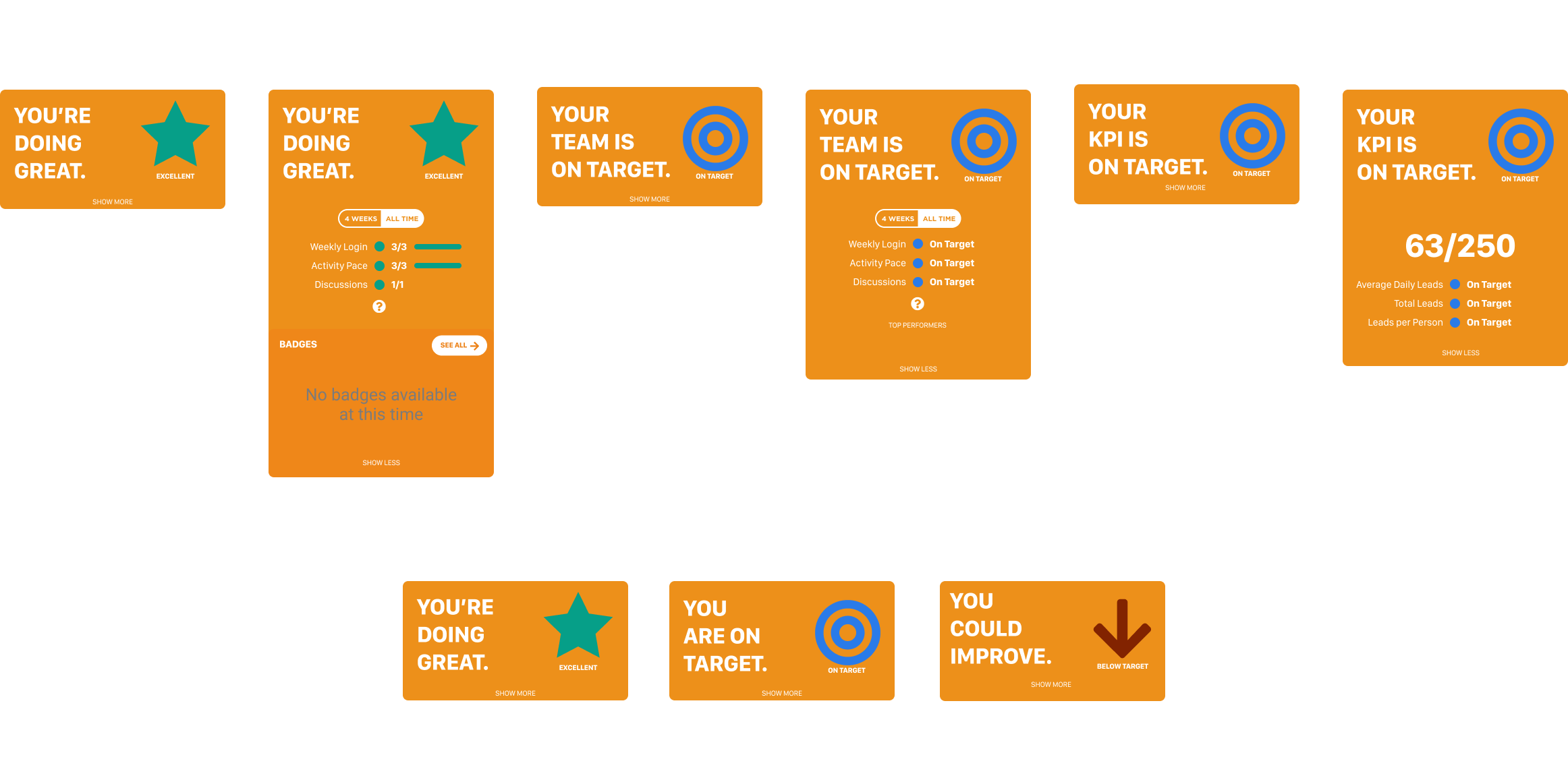
We debated for a long time about how to best express performance. The product this is based on would have pointed to an exact score and would have been presented as a scale of 1-100. Because it wasn’t important to tell people specifically how they were doing (too much calculus for something that didn’t change their actual performance), we decided to express it through categories, essentially great, good, and needs improvement. Since we didn’t need a gauge to express this, we used symbols instead.
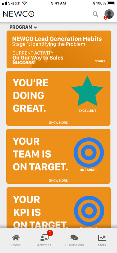
We didn’t want to discourage users who might have fallen behind early so we made sure to include a four-week trend so people felt like they could come back and get a win by the conclusion of the program. Below, we have a screenshot of the screen as it would look all together.
Conclusion
We are currently in production. We are applying the styles and content to the developed framework and conducting a thorough QA. We are now in the testing phase and will be conducting a series of usability tests to fine-tune our product. Once we are satisfied with v1, we will begin work on the next version which will enhance existing features and introduce new ones. We are excited to see this come to life before our eyes!