TFA Cover Sheet
Custom cover sheet for TFA member documents
Project Summary
Teach For America approached me looking for a new document cover and table grid for their documents. They wanted me to follow the tone of the original document and sent it to me as an example. They were looking for something more lively and modern, but something quick that fit their budget.
I designed a document cover and an updated table that suited their needs. They love the new cover and has become a goto for new documents.
My Role
Designer
Company
Teach for America
Date of Project
Q2 2020
The Challenge
Teach For America’s Las Vegas Chapter approached me with a problem. They had an existing document template that was created internally but it was outdated and not very flexible. They had an upcoming event and wanted to new document to fit the new content, and anything that could be done to improve the cover would be greatly appreciated, though not required. I was approached Tuesday and the document needed to be distributed by the end of the week, 3 days later.
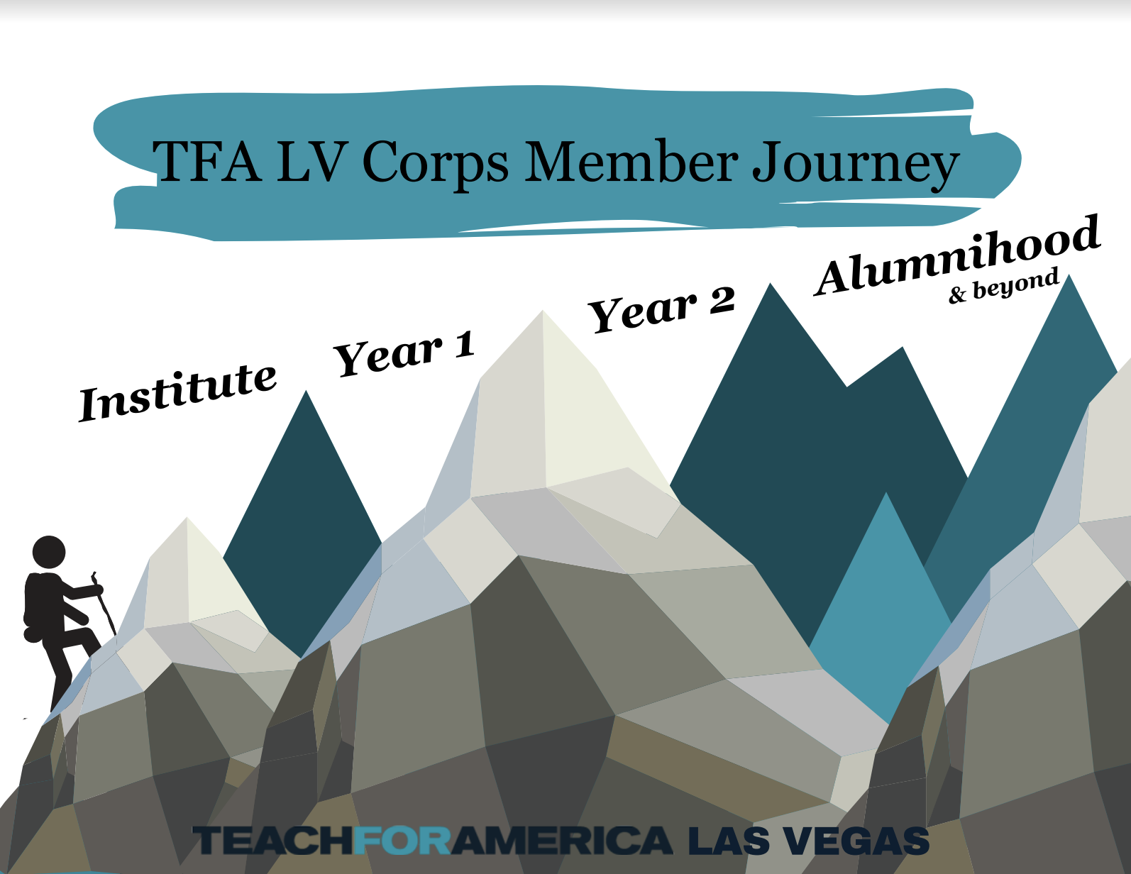
The Old Cover
As you can see, there were issues with the old cover that made it dated and unpolished. There are seams throughout the polygon mountain, and the readability suffers with the text overlaid at the bottom. There is also the juxtaposition of the modern geomtric mountain and the rounded, detailed climber, plus the more traditional serif font used for each of the peaks. I wanted to get the information across but in a less didactic way, and these were the thoughts that guided my design. The blue colors seemed to be important identifiers, while the earthy tones seemed to have no real importance or relation to the brand, and ended up creating a lackluster welcome experience.
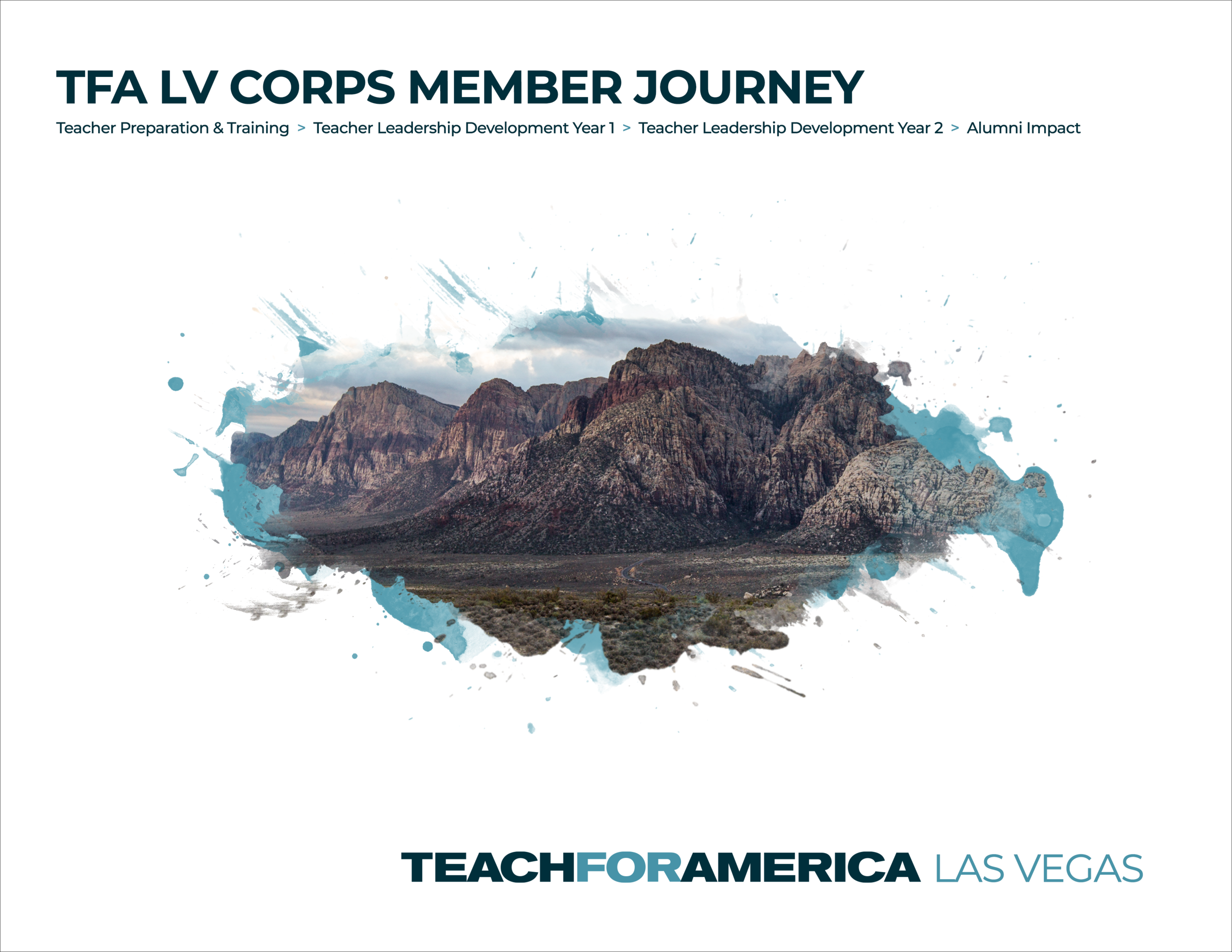
The New Cover
For the new cover, I wanted to create something lively and exciting. I drew inspiration and color choice from the original cover pictured below. I happened to have taken a photo of the famous Red Rock Mountains just outside of Las Vegas. I thought the splash of water color effect help bring life and energy to the piece. I chose a strong sans serif font in Gotham for a poster feel, and I think it gives the piece confidence and authority. For the copy, I used Calibri since that was specified by the client as the font they commonly use for documents.
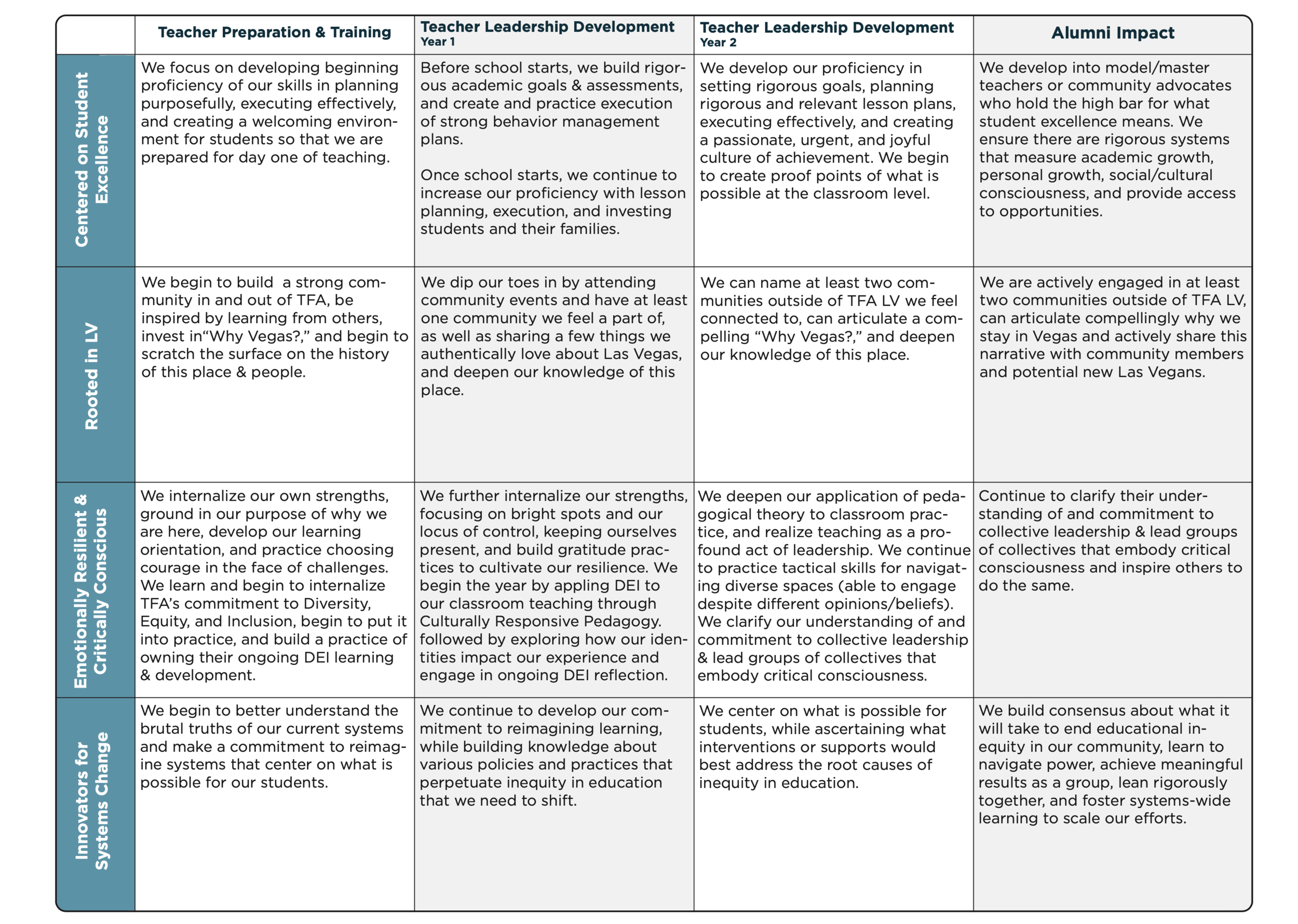
The Table Section
The table of information required was very dense and I did my best to distribute it in a way that was still legible. Since the information was already approved and the deadline was quickly approaching, edits to the copy were minimal. I ended up producing two versions, one with more room but spread over two pages and this table, which the client preferred, as a one pager. I made some minor copy changes to fit the content while maintaining a consistent font size.