Performance Dashboard
Web App integrated into existing internal Hilton platform to increase performance for a service KPI during a quarterly contest.
Project Summary
The KPI Dashboard is a customizable web app that allows teams to see their relative performance against a particular KPI and then offers special recommendations for improvement based on their performance. This also provides a space for the top teams to share their successes so others can learn new behaviors that can lead to their own improved performance. The KPI Dashboard works in tandem with ongoing communications to help drive traffic and interest. The page elements are also flexible and updated regularly to keep audiences engaged. This was a project I worked on as an employee of Arnowitz Culture Agency and worked in concert with the Aurora Culture Engine.
My Role
Project management, low-high fidelity wireframes, design, illustration, execution/sustainment
Company
Client: Hilton
Employer: Arnowitz Culture Agency
Date of Project
Q2 2019
The Challenge
We received a call at 10 am from our client at Hilton. They were interested in running a contest and wondered if it was possible if we could support the project through our online community (a site connecting tens of thousands of Hilton Team Members from around the globe). I told the client we had a tracker like this already that I think we could adapt, and we could engage people where they are on the site instead of sending them away. He replied, I can give you 15 minutes if you can walk my colleagues and I through what you have. My coworker and I got right to work on our presentation, and by the end of it, the client was excited. We won the bid and it was time to put it all together.
The Solution
Planning and Project Launch
To set the stage, I was a Community Manager at Arnowitz Culture Agency, managing four (eventually 8) of our global culture communities. This project was specific to our largest community, Hilton Hotels & Resorts, with over 70,000 team members. We worked closely with the Hospitality team for weekly communications, contest launches and support, curating top team member stories, etc. This specific project was to create a contest dashboard that lived within our platform, meaning we were able to integrate it into something that already lived within the Hilton ecosystem but was also restricted by the existing framework of the platform.
The project, in more detail, was to support a global contest based on a customer service KPI. All 70,000 members needed to be able to see their hotel’s KPI score (updated weekly) along with recommendations for improvement, rank within the region, the latest communications, and best practices from the field. Additionally, we would provide helpful resources from the brand.
This was the existing technology we started with to create the new dashboard:
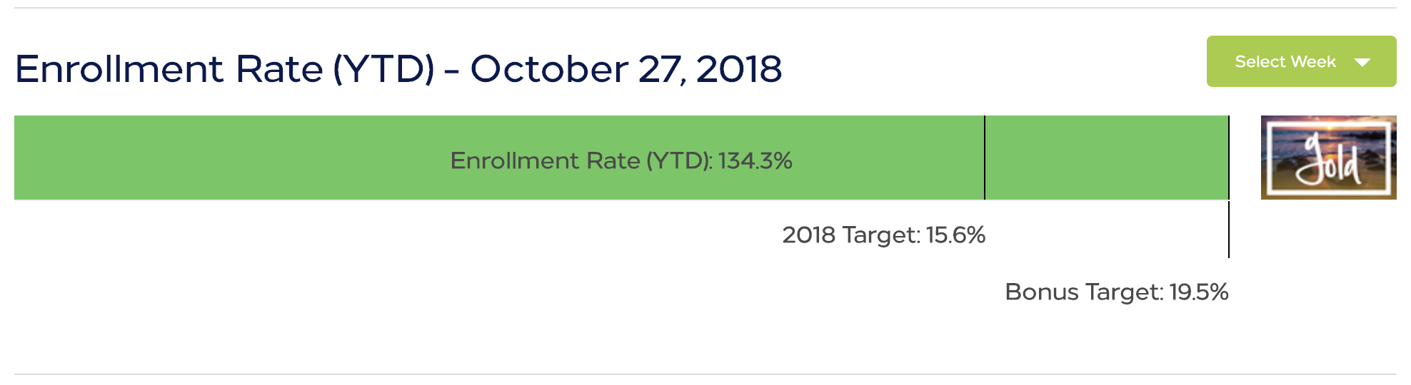
Our client was clear in what they wanted to see for this dashboard. They wanted it to have a friendly and welcoming look and feel. Hilton projects generally stick pretty close to the requirements of the style guide but the client urged us to go beyond the typical light and dark blues of typical designs and dig into secondary colors as well. They wanted to show each team member their hotel’s current score (updated weekly), hotel rank in the region, and a leaderboard to see who’s on top. Additionally, they wanted to see content based on their current standing. The client asked for a racing theme but let us suggest a visual direction and style. The client had a short timeline, as we were in Q1 and it needed to start in Q2.
Since this was my first one-off project lead, I worked closely with my manager to ensure I was following proper protocol for budget and proposal. I also met several time with our technical lead to communicate the needs of the client and come to consensus on how this would come together technically, and especially what we could deliver in the expected timeline.
We prepared a plan that launched in two phases. The import function of the dashboard could only accept one KPI data point, so we focused on tracking one category for the first quarter and add the other two trackers for the subsequent quarters. The client was happy with this, especially since it meant they could start the contest in the upcoming quarter. Both versions would display conditional content depending on their performance level in the main score.
The Design
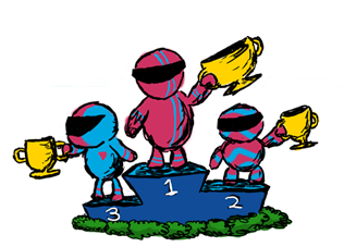
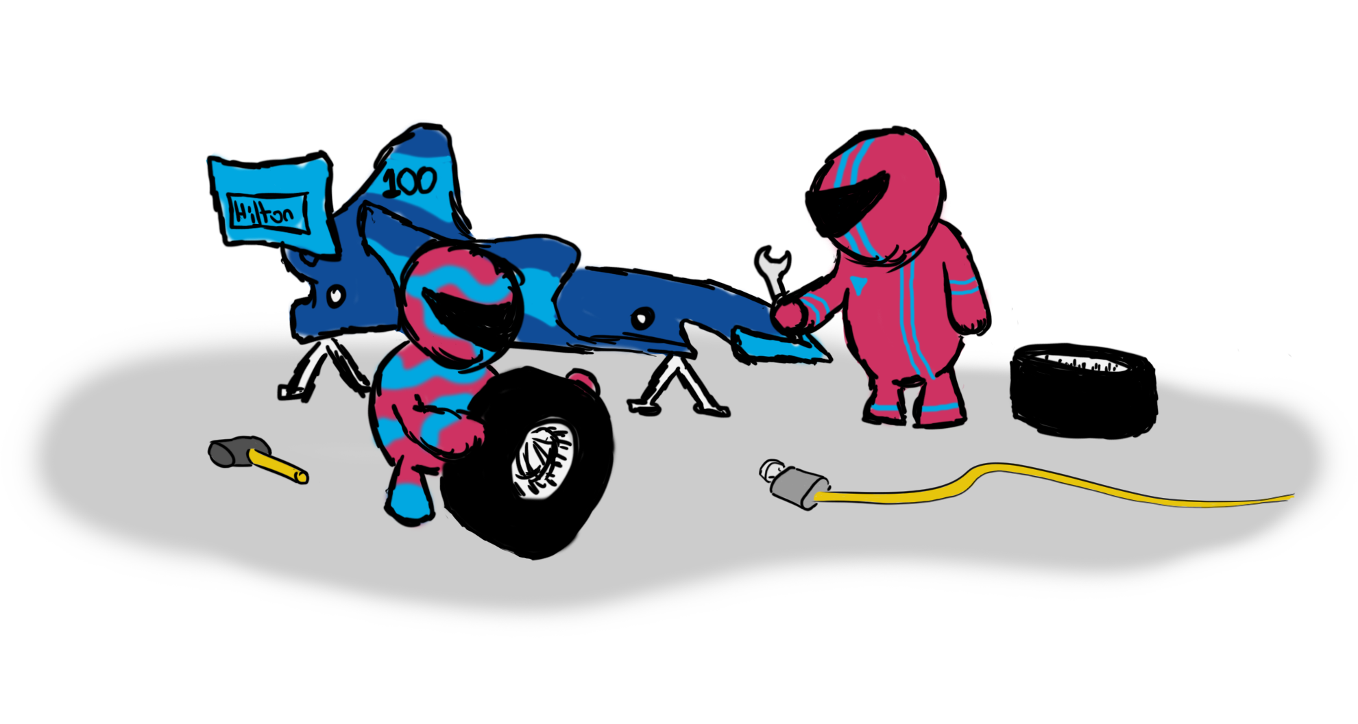
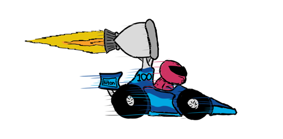
We needed a theme for our contest. The client agreed that racing would be a good fit since Hilton was a sponsor of the McLaren F1 team so we went ahead crafting some ideas. When we showed them the illustrations below, they loved them as is. If I were to create these again, I would have made them vectors so they could be used more dynamically across different environments and they’d be easier to replicate/manipulate for different poses. They use the Hilton blues as well as the Hilton pink that was called out specifically. the ‘100’ on the car denotes Hilton’s 100th anniversary that upcoming May.
Though we certainly were creative with the delivery of this product, we still had a strict style guide to follow, which dictated the fonts, sizing, spacing, and color use. As an example, it was specified that the Simple Joys font be used in conjunction with the Loew font with overlapping and a color jump.
Wireframes
The development team was working away on the core functions in the backend so I spent additional time creating wireframes. I started in Balsamiq with a basic layout of our community site as a starting point and working in content blocks from there. In the image below, you can see how the phase two design was expected to look.
I shared wireframes with the technical lead so we were clear about what data we wanted to see on the dashboard and where. I also wanted to call out where I needed flexibility with the content for theming and styling the page. This was critical for this project but also helpful for future projects in case this needed to be adapted for a different team or client. Below, in the yellow notes, I call out the functions of each section.
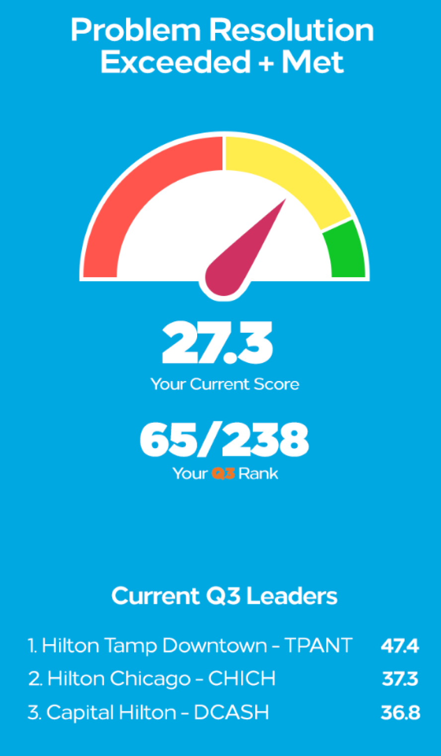
We stayed with a racing theme for Q3 but we updated the characters to be much cleaner and less caricatured. Technically speaking, we introduced two other scores, added animations, changed the progress bar to speedometer style gauges, and expanded our color palate to include secondary hilton colors. This went a long way to bring more life to the contest. Below is an image of the way one of the scores was displayed:
We stayed with a racing theme for Q3 but we updated the characters to be much cleaner and less caricatured. Technically speaking, we introduced two other scores, added animations, changed the progress bar to speedometer style gauges, and expanded our color palate to include secondary hilton colors. This went a long way to bring more life to the contest.
As you can see on the right, a user would access the dashboard and see an animated dial swing to their score which would indicate their performance level (RED, YELLOW, GREEN). The top 10% of scores were green, the next 40% were yellow, and the bottom 50% were red. The box would display the current score, the rank, and the current leaders in the category. A date picker would update the scores based on the week chosen so users could look back at their progress over time.
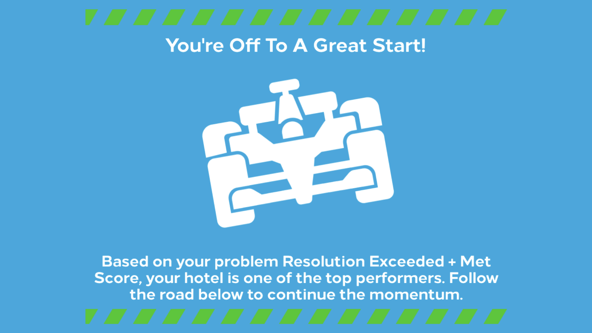
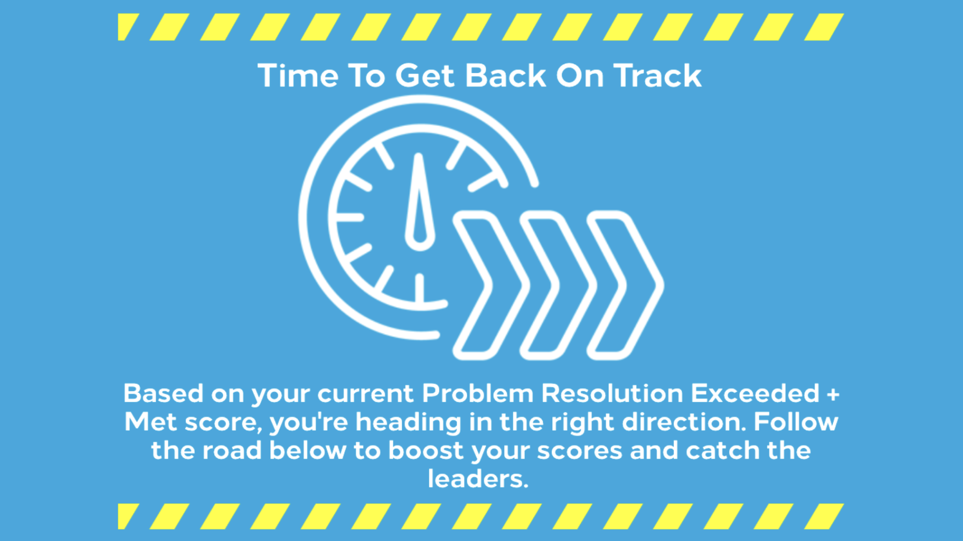
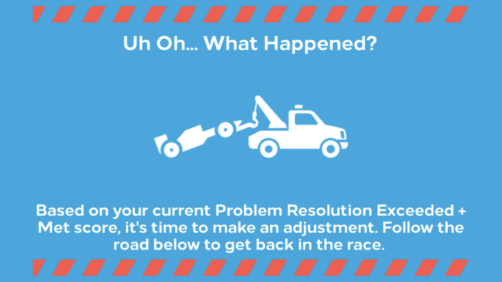
As mentioned, content would populate conditionally based on the performance range. Hotels performing in the bottom 90% were shown either the RED or YELLOW message below indicating a suggestion for improvement. Below this message, there was a best practice updated monthly, that teams could adopt to help improve their scores before the end of the contest. Top performers would likely have ideas that were working for them already, so instead, they would see a message suggesting they share a best practice to help other teams. The performance screens can be seen below.
Roles & Communications
To summarize my role in the project, I was the active community manager of Hilton’s Team Member Culture Site and client contact, which afforded me the opportunity to suggest the idea. I worked closely with my manager to create an accurate budget with proper rates and hour estimates. I communicated directly to the development lead to brainstorm how this would be executed and how long it would take to develop, as well as what we could do given our timeframe.
As the client contact for this project, I collected the client requests and translated it for our development team so they could create the expected deliverable. I reported progress to my manager and the client. I wrote the communication launch plan in coordination with the client. I built wireframes and eventually designed the page, including the car theme illustrations in the original version, and manipulated existing resources for future versions.
Once the project launched, I taught my coordinator how to upload the data and best practice content on the page. I oversaw the operation of the dashboard but my coordinator took the lead on maintaining it. I worked with the development team to create monthly status reports and quarterly winners reports.
Conclusion
The program ended up being a huge success! After one year of the program, we found this to be the most popular section of the community site by page views. Hotels that visited the dashboard page regularly saw an improvement of 6% in the overall category and 42% in the second over the course of the year. This contest closed at the end of 2019 and lead to talks of expanding the program from one site to all 16 sites, though plans were put on hold as the pandemic ravaged many industries including hospitality.